IELTS Academic Writing Task 1 | Reporting Data in a Bar Chart

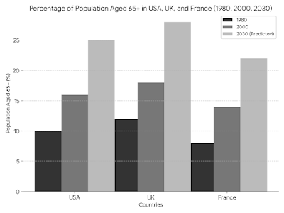
The bar chart shows the percentage of the population aged 65 or older in three countries (USA, UK, France) in 1980, 2000 and forcasted numbers for 2030. Summarize the information, select and report the main features, and make comparisons where appropriate. Sample Response The bar chart depicts a clear trend: the population aged 65 and over is steadily rising in all three developed nations – the USA, the UK, and France. However, the pace of this increase varies significantly across these countries. In 1980, France had the highest proportion of elderly citizens at roughly 14%, with the USA and UK trailing behind at around 11% and 9%, respectively. This indicates that France began experiencing an aging population earlier than the other two countries. Over the next two decades, all three nations witnessed a rise in their elderly population. By 2000, the percentage had climbed to 16% in France, 13% in the USA, and 12% in the UK. Notably, the gap between France and the USA/UK...