Posts

Showing posts with the label IELTS Academic Writing Task 1

IELTS Academic Writing Task 1 | Reporting Data in a Bar Chart

Image
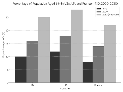
The bar chart shows the percentage of the population aged 65 or older in three countries (USA, UK, France) in 1980, 2000 and forcasted numbers for 2030. Summarize the information, select and report the main features, and make comparisons where appropriate. Sample Response The bar chart depicts a clear trend: the population aged 65 and over is steadily rising in all three developed nations – the USA, the UK, and France. However, the pace of this increase varies significantly across these countries. In 1980, France had the highest proportion of elderly citizens at roughly 14%, with the USA and UK trailing behind at around 11% and 9%, respectively. This indicates that France began experiencing an aging population earlier than the other two countries. Over the next two decades, all three nations witnessed a rise in their elderly population. By 2000, the percentage had climbed to 16% in France, 13% in the USA, and 12% in the UK. Notably, the gap between France and the USA/UK

IELTS Academic Writing | Task 1 | Student Satisfaction Survey

IELTS Academic Writing | Task 1 | Student satisfaction survey IELTS Writing Task 1 | A report The table below shows survey results in which first-year students were asked to rate five different aspects of courses. It shows the proportion of students who rated each aspect of their courses as very good. Summarize the information: select and report the main features, and make comparisons (where relevant). Student Survey Results Course Pre-course Information Teaching Quality Tutor Support Print Resources Other Resources Economics 55% 95% 92% 59% 62% Law 72% 67% 79% 70% 85% Business 93% 96% 92% 80% 85% IELTS Writing Task 1 Sample Answer The table presents the results of a survey where first-year students evaluated five aspects of courses taken: pre

IELTS Academic Writing Task 1 | Australian Students in 5 Countries

Image
IELTS Academic Writing Task 1 The chart shows five study-abroad destinations where Australian students went from 2004 to 2006. Summarise the information by selecting and reporting the main features, and make comparisons where relevant. IELTS Academic Writing Task 1 Sample Answer | Australian Students Studying Abroad The chart depicts where Australian students chose to study abroad from 2004 to 2006. The clear winner was the USA, with the most students heading there each year. Looking closer, in 2004, slightly more students picked the USA (around 20,000) compared to the UK (18,000), which came in second, both significantly higher than the others. This gap between the two countries narrowed slightly over the next two years, but the USA still remained the most popular choice. Canada was also a popular destination, although fewer students chose to study there in 2004 (15,000). However, this rose to around 17,500 in 2006. On the other hand, New Zealand and Japan

IELTS Academic Writing Test Task 1 | A Report | Energy Usage Comparison

Image
The bar chart below shows the usage of coal, oil, hydropower, wind, and renewable sources for energy production, in 2002 and 2022. Summarise the information by selecting and reporting the main features, and make comparisons where relevant. High-Scoring IELTS Band 9 Sample Answer (Bar Chart) The bar chart illustrates a significant shift in energy usage patterns between 2002 and 2022. In 2002, fossil fuels dominated, with coal accounting for a substantial 60% of energy production. Oil followed closely at 25%. Conversely, renewable sources played a minor role, with hydropower at 10%, wind at a mere 3%, and other renewables constituting a negligible 2%. However, the picture in 2022 is markedly different. A notable decline in reliance on fossil fuels is evident. Coal usage has almost halved, dropping to 35%. Oil consumption has also decreased slightly to 20%. In contrast, a surge in renewable energy sources is apparent. Wind power has seen a remarkable fivefold increase

IELTS Writing Task 1 | Describe a Graph | UK Transport 1990-2000

Image
IELTS Writing Test | Task 1 The graph illustrates the distances traveled by passengers on 5 types of transport in the UK in 1990 and 2000. The data is presented in kilometers per person, per week. Summarize the information by selecting and reporting the main features, and make comparisons where relevant. Band 9 Answer The bar chart depicts the average weekly travel distances per person across various modes of transport in the UK, comparing 1990 and 2000. Overall, car travel saw a significant rise, while most other modes witnessed a decline or stagnation. In 1990, car travel stood out as the most popular choice, averaging 120 kilometers per person per week. This figure rose considerably to 180 kilometers by 2000, representing a 50% increase. Conversely, local bus usage suffered a substantial drop, falling from 80 kilometers per week in 1990 to just 40 kilometers a decade later. Similarly, travel by train remained relatively stable, fluctuating between 40 and 50 kilometers

IELTS Writing Task 1 | Oil Production | Four African Countries

IELTS Writing Task 1 The table below shows oil production figures for four Africans countries from 2000 to 2004, in barrels per day. Summarise the information by selecting and reporting the main features, and make comparisons where relevant. Year Nigeria Angola Libya Algeria 2000 2,112,000 797,000 1,517,000 1,425,000 2001 2,214,000 843,000 1,505,000 1,441,000 2002 2,225,000 863,000 1,503,000 1,490,000 2003 2,399,000 1,108,000 1,659,000 1,560,000 2004 2,319,000 1,207,000 1,812,000 1,625,000 Example Answer The provided table presents oil production figures, measured in barrels per day, for four African countries – Nigeria, Angola, Libya, and Algeria – over a five-year period from 2000 to 2004. In 2000, Nigeria had the highest oil production among the four countries, with 2,112,000 b

How to Answer IELTS Academic Writing Task 1 | Describe a Graph

Image
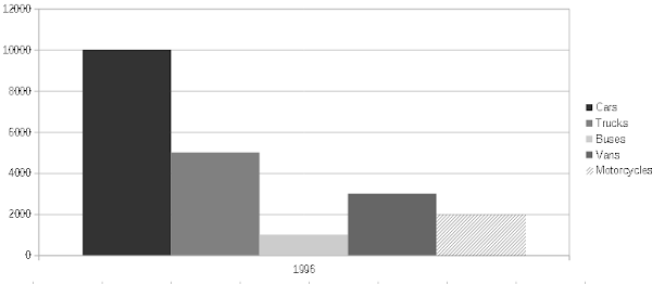
IELTS Academic Writing Task 1 The charts show the number of road vehicles registered in five categories in a European country in 1996 and 2006. "Summarise the information by selecting and reporting the main features and make comparisons where relevant." Road-going Vehicles Registered in a European Country 1996 & 2006 Task 1 Sample Answer The data illustrates how many roadgoing vehicles were registered in a European country in 1996 and 2006 across five categories: cars, trucks, buses, vans, and motorcycles. Overall, there was a noticeable increase in the total number of vehicles over the ten-year period. In 1996, the country had 10,000 cars, 5,000 trucks, 1,000 buses, 3,000 vans, and 2,000 motorcycles. By 2006, these figures rose significantly to 15,000 cars, 7,000 trucks, 1,500 buses, 4,500 vans, and 2,500 motorcycles. Cars constituted the predominant proportion of registered vehicles in both years, followed by trucks and vans. Interestingl

IELTS Academic Writing Task 1 | Leisure Activities | Chart

Image
Favorite Leisure Activities - Task 1 IELTS Writing IELTS Writing Task 1 You should spend around 20 minutes on this task. The chart below shows popular leisure time activities for different age groups in the UK for the year 2010-2011. Summarize the information by selecting and reporting the main features and make comparisons where relevant. Write at least 150 words. Leisure Time IELTS Writing Task 1 Popular UK Free Time Activities Answer: The bar graph illustrates how popular certain free time activities were for specific age groups of the UK population during the period 2010 to 2011. Overall, it can clearly be seen that the most popular free time activity was watching TV (87.6 per cent of adults aged 16 and over), followed by spending time with friends or family (83.5 per cent) and listening to music (73.7 per cent). There was however some variation with age. The same three most popular activities were reported for all age groups from 25 to 64. The pro

IELTS Academic Writing Task 1 | Water Storage Data (Table)

IELTS Academic Writing Task 1 The table below contains information about the volume of water stored in 2015 and 2016 by five cities in Australia. Summarize the information by selecting and reporting the main features and making comparisons where relevant. Water Storage Capacity and Volume (in Megalitres) CITY CAPACITY VOLUME % FULL YEAR CAPACITY VOLUME % FULL YEAR Adelaide 197,405 192,567 97.5 2016 197,405 114,756 58.1 2015 Sydney 2,581,850 2,448,064 94.8 2016 2,581,850 2,508,265 97.1 2015 Melbourne 1,812,175 1,265,605 69.8 2016 1,812,175 1,342,284 74.1 2015 Darwin 285,450 205,800 72.1 2016 285,450 217,560 76.2 2015 Canberra 277,839 277,839 100.0 2016 277,839 228,432 82.2 2015 IELTS Academic Writing Task 1 Answer | Water Storage in Australia The data shown in the table relates to the storage capacity of water and the actual amount of water stored in Adelaide, Sydney, Melbourne, Darwin and Canberra in Aust